Visual Design Full Case Study:
Logo & Web Design for CISVA's Faith Development Day
Problem:
The Catholic Independent Schools of Vancouver Archdiocese (or CISVA) is comprised of 46 elementary and secondary schools throughout the Greater Vancouver Area. Every year the CISVA Superintendent's Office hosts a system-wide back-to-school professional development event to kick off the school year for over 1500 teachers, support staff, principals, and community members. Since restrictions were in place due to the COVID-19 pandemic, the event took place online for the first time.
The team at the Superintendent's Office faced the question, "How can we provide a valuable professional development experience to the CISVA staff that would ensure that they learn, have fun, and can be inspired and prepared to take on another school year during the pandemic?"
Team Goals & My Deliverables:
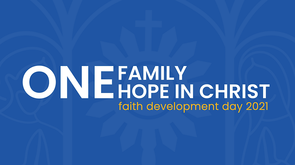
Our team's goal was to make the Faith Development Day (the professional development event) into more than a glorified Zoom meeting, but an actual virtual experience with its own unique message and brand. We wanted the staff not to feel isolated at this time, but to feel connected to their Catholic school communities. Various committees assembled to bring the new school year theme -- One Family, One Hope in Christ -- to life by instilling the themes of unity in Christ, strength in family and community, and having Christian hope always.
As CISVA's multidisciplinary Digital Media Specialist, my deliverables included :
1. Creating an online virtual experience that would inspire unity and hope within the Catholic school-parish communities
2. Designing all the static visual design assets that would be projected on the live stream, including the event logo, PowerPoint slides, lower third name tags, and more.
3. Design a website with event information that would also serve as an "online stage" where all 1500 participants would view the event from home or in their small viewing parties at their individual schools
Starting with the Logo
The logo design process began with meeting the event's Creative Director. We discussed the school year/event's theme, "One Family, One Hope in Christ." Together we narrowed down that the logo should be authentically Catholic but have a fresh, modern, and clean style. The logo should also inspire the event themes of unity in Christ, strength in family and community, and inspire Christian hope. With that said, the following visual elements needed to be included:
[ 1 ] The Holy Eucharist - Unity in Christ
According to the Catholic teaching and tradition, the Holy Eucharist or Communion is Jesus Christ fully present and not a mere symbol. Therefore, the Holy Eucharist is believed to be the "source and summit of the Christian life" which brings all Catholics together throughout the world.
[ 2 ] The Holy Family - Strength in Family and Community
The Holy Family (Jesus, Mary, and St. Joseph) is highly regarded as the Catholic Church's most beloved family whom all Christian families ought to strive to imitate and emualte. Included in this family are Jesus, his mother Mary, and his foster father St. Joseph.
[ 3 ] Select colours and typeface to represent and inspire Christian hope
I spent time researching and drew inspiration from various forms of Catholic imagery, art, and architecture

After researching and sketching by hand, a series of logo variations came to life digitally


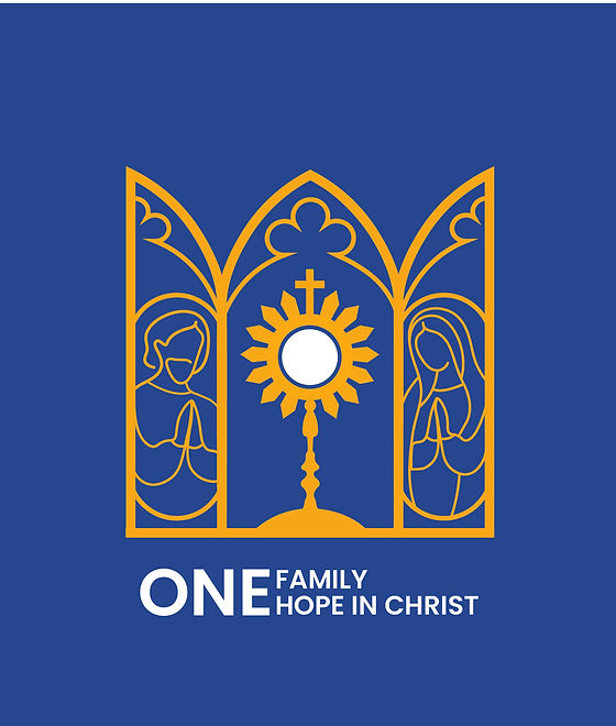
The winning logo design best portrayed the strength and boldness of Jesus in the Holy Eucharist as the prominent unitive figure. This was visually demonstrated through the monstrance's symmetrical elements and its closely uniformed weighted lines.
Description of Visual Elements Incorporated into the Logo Graphic
[ 1 ] The Holy Eucharist - Unity in Christ
The monstrance containing the Holy Eucharist is found in the center of the logo graphic. The size of the monstrance appears to be slightly bigger than St. Joseph and Mother Mary to display its close relation, but also its greater prominence as the unitive figure in the Church which brings hope to all.
[ 2 ] The Holy Family - Strength in Family and Community
The images of St. Joseph and Mary look inwards and towards Jesus, displaying their hope in Him. St. Joseph is seen on the left side because fathers in the Catholic tradition have a unique role as the head spiritual leaders in the home. Mary appears on the right side, not because she is second to St. Joseph, but primarily because her image is an ode to the miraculous image of Our Lady of Guadalupe, a very popular Catholic devotion in the Americas.
[ 3 ] Inspiration from Gothic-Revival Cathedral Architecture
Cathedrals are often grand in size and decorated beautifully; the same can be said about the people who make up the Kingdom of God. While cathedrals may be colossal, it is often experienced as a safe haven for many believers. The cathedral which surrounds the Holy Family acts as a home with its doors open wide to welcome all who willfully walk in.
[ 4 ] Creating a Design System - Blue, Yellow, and White Colours
The blue colour is a brighter version of CISVA's primary brand colour. Together with yellow, it is closely identified with the Roman Catholic Archdiocese of Vancouver's brand colours, which are non-coincidentally blue and yellow, showing how this event is symbolically united with all the Catholic churches in the Greater Vancouver Area. In addition, yellow is a bright colour which conveys light and brightness, thus a sense of hope. The colour white, as presented in the Holy Eucharist, is the brightest of all the colours, conveying that the greatest hope can be found in Jesus.
Close-to CISVA Blue
HEX: #1C54A5
No Place like Hope Yellow
HEX: #F7B21A
True Light White
HEX: #000000
[ 5 ] Creating a Design System - A Typeface Called Poppins
The typeface throughout the event branding is from the Poppins font family. This typeface was selected because it is a clean, modern, and minimalistic typeface that complements the logo graphic. As well, Poppins comes in a variety of weights, making it versatile and easy to use to display textual hierarchy. In addition, this font was selected from the options for web-based fonts on Unbounce, the online platform used to create the website.
The event logo was featured on various digital assets, including social media, all visual elements shown on the livestream, and throughout the event website. The logo was also printed for the in-person set design.


The Website
The online platform used to create the Faith Development Day website was Unbounce, which is typically used for creating landing pages for marketing campaigns. This program was selected because it was proven to work well for the Upper Room conference hosted by the Archdiocese of Vancouver. In the future, I would not recommend using this platform simply because there are more efficient alternatives.
The Process
[ 1 ] Outlined all the requirements for the website
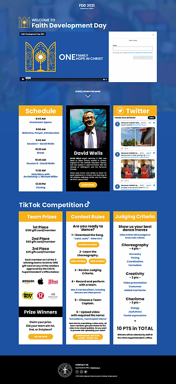
The website requirements were very minimal. It needed to provide information about the event, the speaker, and schedule details. In addition, the event had to host the live stream video and chatbox from Vimeo, and share information about the Tiktok dance competition.
[ 2 ] Created a wireframe for the pages
Designing the wireframe was rather simple and only required two pages.
HOME PAGE
LIVESTREAM PAGE
FDD logo
button
Keynote Info
button
Schedule Info
Contact Info
button
Welcome Title
Schedule Info
Keynote Info
Twitter Feed
TikTok Info
Contact Info
[ 3 ] Designed the website and tested, asked for feedback, and made updates
HOME PAGE

LIVESTREAM PAGE
Successful Event, Positive Feedback
During the event and after, a myriad of school staff provided positive feedback on their virtual experience. Many people enjoyed the talk presented by the keynote speaker, had fun participating in the TikTok dance competition, and loved the design of the website and their overall virtual experience.